Home / Case studies / PGE Milliken Transmission Line Rebuild
PGE Milliken Transmission Line Rebuild
Client / Partners
Portland General Electric (PGE)
What I did
- Role: UX Developer, Accessibility, Frontend
- Timeline: Ongoing (multi-year rebuild; 2-year public site lifecycle)
Tools / Platform
- Platform: Squarespace, custom HTML/CSS/JavaScript, ArcGIS Experience Builder, Weglot
- Focus: Accessible construction awareness, data-driven mapping, bilingual support
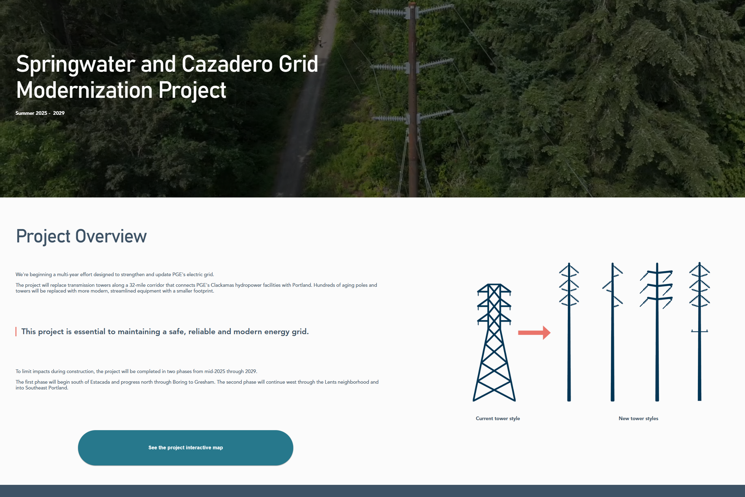
The Milliken Transmission Line Rebuild site is a public-facing information hub for a multi-year corridor reconstruction project. It helps communities along the route understand construction impacts using plain language, clear timelines, and an interactive map that connects project segments to real-world locations and visuals.
Page views (first 4 months)
2,000+
Project status
Ongoing
Accessibility standard
WCAG AA / Section 508
Making Construction Impacts Understandable by Location
The Challenge
Transmission line rebuilds have localized impacts that are difficult to grasp through text alone.
This project needed to communicate where construction would occur, what changes residents could expect, and when different segments would be affected—without assuming technical knowledge.
Prior to the site, there was no centralized, accessible way to connect project segments with real-world locations and visuals in a digestible format.
Equitable access was a core concern: without plain language, bilingual support, and accessibility, the people most affected risked being excluded from critical information.
CMS Ownership + Accessibility Requirements
Context & Constraints
The platform needed to remain easy for the client to manage over the life of an ongoing project, so Squarespace was selected for long-term ownership and content updates.
A major technical requirement was an interactive map that aligned construction segments with imagery and geographic context—more like an application than a static embed.
The site was required to meet WCAG AA and Section 508 standards and follow plain-language and DEI best practices.
Using Mapping to Increase Clarity Without Increasing Cognitive Load
Approach
Rather than defaulting to familiar tools, I approached this as an opportunity to test whether a purpose-built mapping solution could better serve the public.
The approach centered on three guiding questions: how to make geographic data intuitive for non-technical users, how to use interactivity to enhance understanding without adding cognitive load, and how to maintain accessibility and bilingual support within a CMS-driven site.
Ease of use for both the public and the client remained a primary constraint throughout.
Tooling and Integration Choices
Key Decisions
Instead of a standard Google Map embed, I selected ArcGIS Experience Builder to support data-driven interactivity and better align corridor segments with visuals and contextual details.
Because ArcGIS Experience Builder was new to the agency workflow, I learned it mid-project and implemented a custom map experience using data tables and layered geographic information.
Since Weglot does not automatically translate iframe content, I implemented custom JavaScript to synchronize language state between the main site and the embedded map experience for consistent bilingual access.
Accessibility as a Build Constraint, Not a Final Pass
Accessibility & Inclusive Design
Accessibility was integrated throughout the project rather than treated as a final review step.
The site was designed and tested against WCAG AA and Section 508 standards, including color contrast validation, semantic reading order, keyboard navigation, and mobile responsiveness.
Layouts were tested across browsers and screen sizes, and the site was navigated using only a keyboard to validate focus order.
Alt text was written intentionally and documented for client reference, and bilingual functionality was tested to ensure consistent access across supported languages.
Early Engagement + Clearer Corridor Awareness
Outcome & Impact
Within the first four months of launch, the site received over 2,000 page views and hundreds of unique visitors, indicating strong early engagement from communities along the corridor.
Stakeholders expressed satisfaction with the clarity of communication and the effectiveness of the interactive map in helping the public understand construction impacts and locations.
Choosing Better Tools and Building App-Like UX Inside a CMS
What I Learned
This project reinforced the value of staying open to new tools rather than defaulting to familiar solutions.
By learning ArcGIS Experience Builder mid-project, I delivered a more meaningful, data-driven experience for public understanding.
It also strengthened my confidence in building application-like interfaces within CMS constraints—showing that thoughtful tool selection can improve comprehension without requiring a modern frontend stack.
A Portfolio Example of Technical Exploration With Public Impact
Why It Matters
This project demonstrates my ability to learn new technologies quickly, integrate data-driven tools into accessible public-facing experiences, and balance usability with long-term maintainability.
It highlights a problem-solving mindset that prioritizes clarity, equity, and real-world constraints.
An interactive map wasn’t a feature—it was the clearest way to communicate impacts equitably.
Implementation Highlights
- Designed website mockups with a clear, flexible information hierarchy
- Built the site in Squarespace using limited, intentional navigation
- Developed an interactive mapping application using ArcGIS Experience Builder
- Implemented custom JavaScript to synchronize bilingual toggling across embedded map content
- Designed and applied brand colors and visual styles
- Built a responsive, custom-coded project timeline using HTML, CSS, and JavaScript
- Conducted accessibility checks including contrast, keyboard navigation, and alt text
- Delivered analytics and SEO reports to support ongoing outreach strategy